The Components of the Office 365 Communication Site
In our previous installment, The Basics of the Office 365 Communication Site, we discussed the basics of the Communication Site, including when to use it, the type of content that could be shared, what to expect when creating it, what devices are compatible and the different web parts for inclusion of images, video and such.
In this installment, we will look at what components comprise the communication site and delve into greater detail of each component.
Ease of Creating the Communication Site
The creation of a Communication Site is simple and straightforward. There are three site designs that you can choose from as the basis for your Communication Site. These are:
1. Topic: sharing of information including events, news, launches, and other content;
2. Showcase: featuring a product, team, or event with the use of photos or images; and
3. Blank: a blank page allows you the creative space to design and customize your own layout.
In each site design, you have the ability to add, remove, or reorder web parts. In addition, if you have permission to edit the site, at the top of the Communication Site is a link to add a new list, page, document library, news post, or web app to the site.
Preformatted site designs aid in the ease of designing the Communication Site and with three different layout styles, how you want to communicate is made easy.
Site Designs in Detail
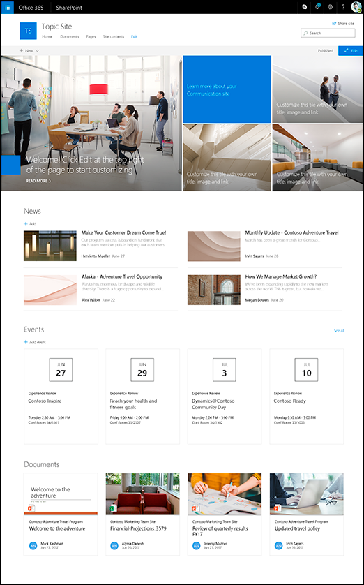
1. Topic
When you want to share with your broad audience information regarding events, news, updates and other content, the Topic design would be the most ideal. When you create a Communication Site based on the Topic design, your homepage includes several web parts that are highly customizable. The default web parts included for the Topic design for a Communication Site include the Hero, News, Events, and Documents.
Hero
This web part brings visual interest and focus to your page. With the ability to display up to five items in the Hero web part, you can draw attention to each by adding compelling images, text, and links.
 The default layout is five tiles: one large tile on the left and four smaller tiles forming a square on the right. The number of tiles can be changed and can range from one tile to five tiles.
News
With the News web part, you can engage your team with interesting stories and important information. Keep them informed of what is happening with status updates, eye-catching posts, announcements, and people news through graphics and rich formatting. The News web part has a default layout called Top Story which displays on the left with a large image space, and to the right, in list format, three additional stories. The second layout style is called Side-By-Side which lists stories in two columns. The final and third layout style is called the List which shows the news posts in a single column. With the News web part, you have the option of choosing the layout that best suits your needs.
Events
Upcoming events can be displayed in the Events web part. Information regarding the event such as date, time, location and the ability to add it to your calendar are all functions of the Events web part.
Documents
The beauty of Microsoft products is the usability of its products across platforms. In the Documents web part, you can insert documents created from Word, Excel, Visio, and PowerPoint. The starting page of the document is in a frame and allows the user to scroll through the pages or, if they choose, to download the document.
2. Showcase
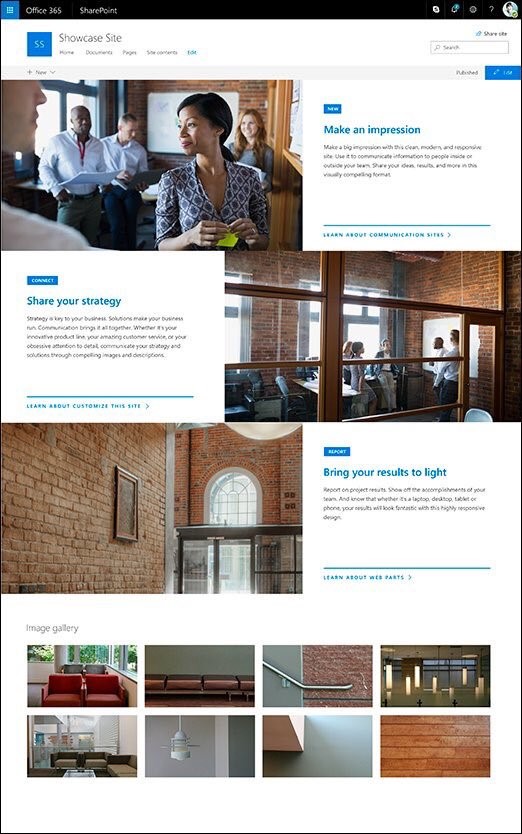
 The Showcase design is to bring focus and attention to your featured highlights through the use of attention-grabbing graphics. The default web parts included in the Showcase design in conjunction with the Communication Site are Hero and Image Gallery.
Hero
For the Showcase design, there are two Hero layout options. The first is the Tile layout and the second is the Layer layout. The default is a vertical layout with three layers but you have the option of changing the number of layers from one to five.
Image Gallery
A picture says a thousand words, so naturally, an Image Gallery could be used to convey many messages and ideas to your audience. The Image Gallery web part shares collections of images on a page. Create your gallery by drag and dropping your selected images, and then ordering them in the sequence that is preferred. Images can be viewed in a tile layout or as a carousel.
3. Blank
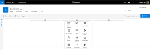
Unlike the previous two site designs, the Blank design allows you to choose your page layout. After you have chosen your page layout, you then add the web parts that you want.
The page layout can also be customized by rearranging the web parts, and by adding, removing, or changing columns on the page.

We have now reviewed each of the individual components that make up the whole of the Office 365 Communication Site. In our previous installment, Part 1: The Basics of the Office 365 Communication Site, the fundamentals for the Communication Site were addressed. In this second installment, we looked closer at the building blocks for the Communication Site. Now that we understand the different types of site designs, web parts and layouts, we are now ready to begin creating the Office 365 Communication Site, which is discussed in Part 3: Creating and Sharing an Office 365 Communication Site.
 Friday, June 30, 2017
By : Mike Maadarani
 0 comment
Archives
- December 2024
- November 2023
- October 2023
- September 2023
- August 2023
- January 2023
- November 2022
- October 2022
- May 2022
- March 2022
- January 2022
- December 2021
- November 2021
- October 2021
- March 2021
- October 2020
- September 2020
- July 2020
- March 2020
- February 2020
- January 2020
- December 2019
- November 2019
- October 2019
- September 2019
- June 2019
- May 2019
- March 2019
- February 2019
- January 2019
- December 2018
- November 2018
- October 2018
- September 2018
- August 2018
- July 2018
- June 2018
- May 2018
- April 2018
- March 2018
- February 2018
- January 2018
- December 2017
- November 2017
- October 2017
- August 2017
- July 2017
- June 2017
- May 2017
- March 2017
- February 2017
- January 2017
- October 2016
- September 2016
- August 2016
- July 2016
- June 2016
- May 2016
- March 2016
- February 2016
- January 2016
- September 2015
- August 2015
- July 2015
- June 2015
- April 2015
- February 2015
- January 2015
- November 2014
- October 2014
- September 2014
- November 2013
- July 2013
- February 2013